
Glocal climate change: methodology
Climate change is increasingly under the spotlight of mass-media, considering it as one of the seminal challenges humanity is going to face in the following years. Yet, because of its global impact, much of the information around temperature change is made referring to macro areas if not global temperatures, and this is a virtually inescapable constraint. Yet, thanks to some open data from Copernicus and the European Space Agency, it is possible to overcome this constraint when it comes to data for Europe and, in our case, Italy, and “localize” the impact of climate change.

The data source
The analysis was conducted on the data made available by Copernicus and the European Centre for Medium-Range Weather Forecasts (ECMWF). We used the UERRA/MESCAN-SURFEX dataset, which comprises reanalysis of several climatological variables, and which contains data on the temperature measured at 2 meters above the surface.
The dataset has high granularity and spatial resolution: data is offered as a grid of 1,142,761 cells of 5.5×5.5 km2. This made it possible to locate, as precisely as possible, the effects that climate change is having in every municipality. The data is also very rich, consisting of almost 97 billions data points: each of the 1,142,761 cells comes with four temperature measurements per day, for a period of 58 years (from 01/01/1961 to 31/12/2018).
The mean temperature variation was calculated as the difference of the mean temperature of the last ten years of available data (the period that goes from 01/01/2009 to 31/12/2018) and the mean temperature of the first ten years of data (spanning from 01/01/1961 to 31/12/1970).
Usually climatologists tend to use longer temperature normals, with 30 years of data as baseline. There are various reasons for that choice, but given the descriptive aim of our analysis, and the straightforwardness of communicating differences between periods of the same length, we decided to employ 10 years averaging periods. Here you can find a thorough discussion on how to decide the best fitted averaging periods according to the data.
How to locate climate change
Cells of 5.5×5.5 km2 of area do not say much to citizens. That’s why we did some spatial analysis in order to connect those cells with sub-regional (NUTS-3) and municipal areas: in this way, it is easier for citizens to become aware of the mean temperature variation experienced in the place where they live and, hopefully, connect with the phenomenon.
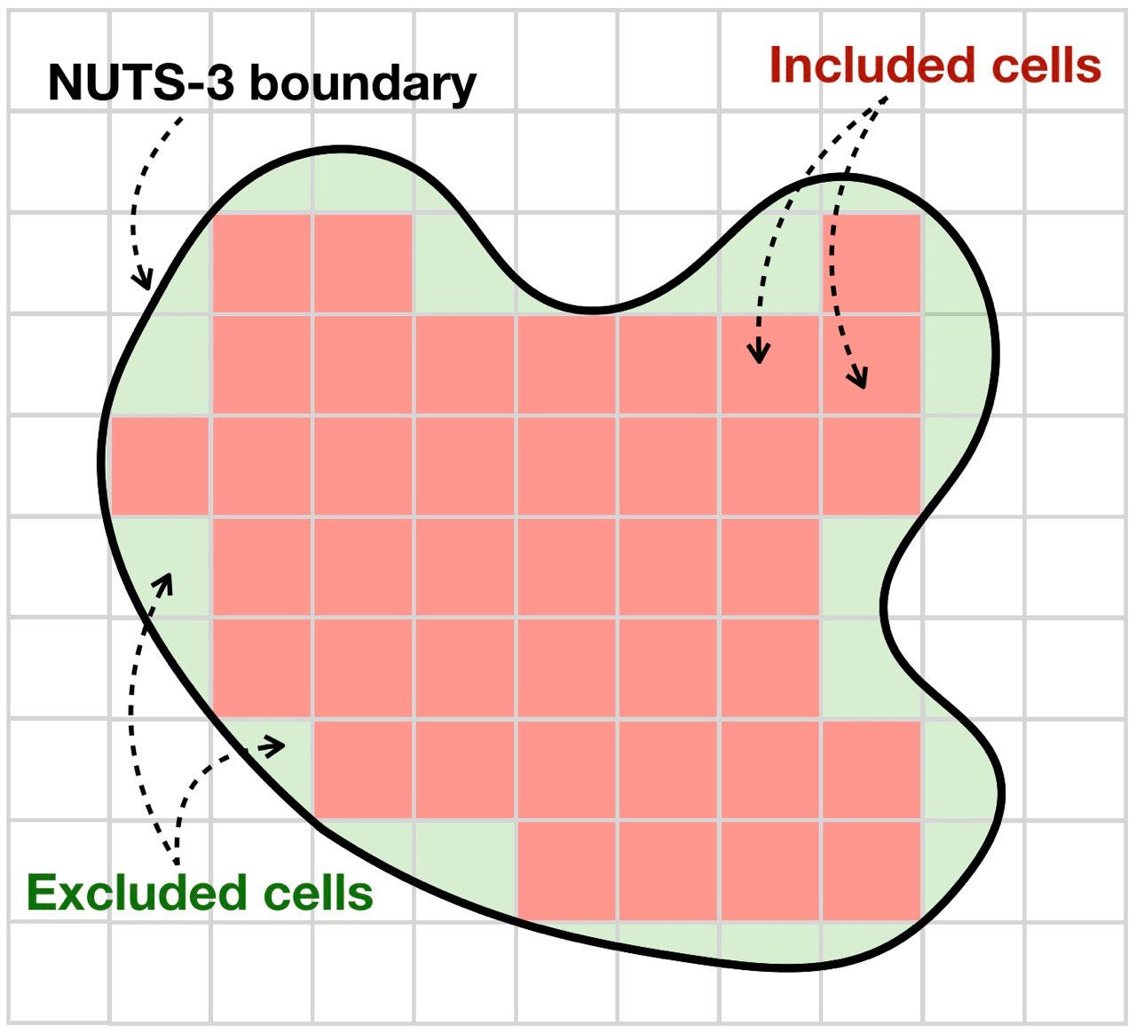
Sub-regional level: Italian “province”
When it came to the NUTS-3 regions level, the proceeding was quite simple. Considering the boundaries of a given provincia, the mean temperature variation was calculated as the mean of the grid cells that completely fall inside the boundaries, as exemplified in the picture below.
Municipalities
For what concerned the municipalities, things were trickier for two reasons:
1. there are many municipalities that contain more than a grid cell, and many others that are too small to even contain a single one;
2. there is a number of municipalities that include within their boundaries a portion of territories such as mountains, lakes, and other habitats with different underlying characteristics.
We had to use the same method for all the municipalities, whether they be large or small, and whether they be territorially very diverse.
To obtain a single value, we associated the city center coordinates of every municipality to the closest grid cell of the available data (having thus a common method for any city).
Yet, to calculate the city center, instead of using the simple geometric centroid, we decided to weight the center based on the population grid. This was made in order to have the center of the municipalities polygons closer to the urban areas. Indeed, when thinking about a city, the average person depicts in its mind the urban area of the city center, generally the most densely populated. A thorough explanation of this method can be found in this outstanding post by Giorgio Comai.
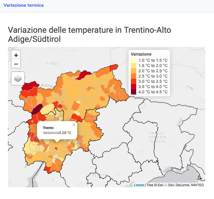
The dashboard
The last step was to create a dashboard to make the data available and fully accessible to everyone, making it possible to have a look at the temperature change for Italian regions with interactive maps:
The dashboard also makes it possible to search each of the almost 8000 Italian municipalities and have a look on how climate change has impacted them:
