
An interactive map on climate warming in Europe
Our analysis looks at the rise in average temperature for about 100,000 municipalities in Europe. Mean temperature values of the 1960s were compared with those of the 2010s, in order to explore the import of global warming at a local level.

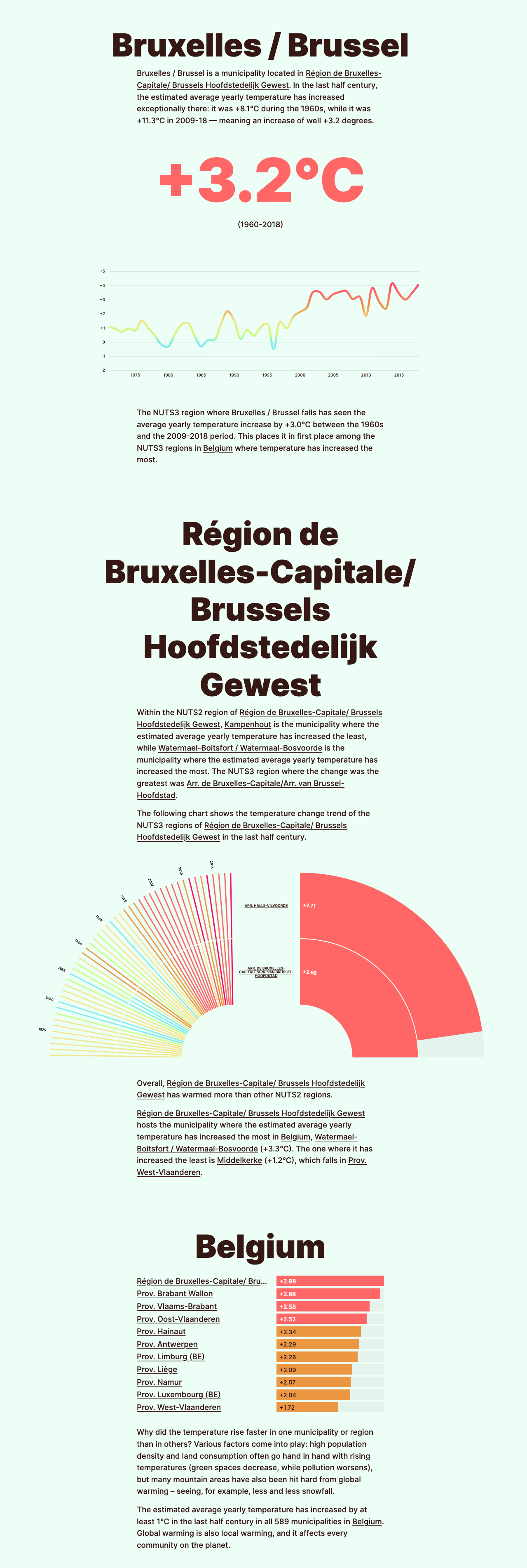
None
An interactive map on climate warming in Europe
Our analysis looks at the rise in average temperature for about 100,000 municipalities in Europe. Mean temperature values of the 1960s were compared with those of the 2010s, in order to explore the import of global warming at a local level.
Global warming is not only about melting icebergs or expanding deserts. It is something which does happen in our backyard as well. Data and estimates on the mean temperatures at the local level indicate that climate change has been affecting almost every corner of Europe, as mean temperatures have increased by more than 2°C in half a century in multiple areas.
Click here to browse the map:

If you click on any municipality, you’ll have access to a dedicated page covering the variation in temperature that took place there, and putting it in a larger context by looking at the trends in the relative region and contrasting them with other regions in the same country. For instance, this is a preview of the page about Brussels:
The data analysis is based on data produced by UERRA regional reanalysis for Europe on single levels from 1961 to 2018 , which was created by Copernicus and by the European Centre for Medium-Range Weather Forecasts (ECMWF). The data provides estimated temperatures values at two meters from the ground and it covers a cell grid, with cells 5,5×5,5 km large.
https://climatechange.europeandatajournalism.eu/en/